Meows Cat Cafe
A visual identity built from the ground up for a cat cafe that helps cats find homes.
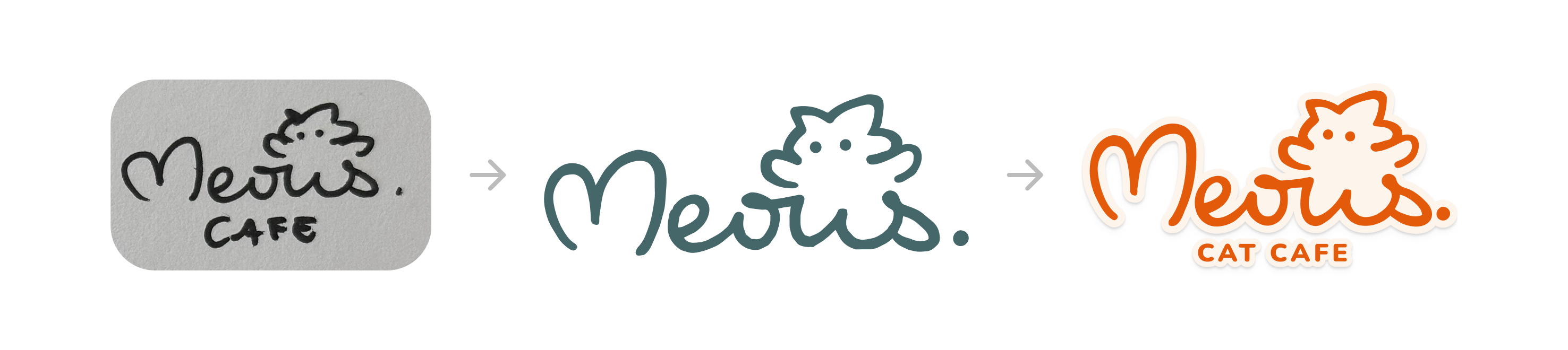
Logo Exploration
During sketching, I wanted to push the idea of building the cat into the entire word mark. The W became a pair of stubby legs, the S curled into a tail, and the cat's head sits on top, tying the whole animal into the name itself.
The W became stubby legs, the S curled into a tail, and the head sits on top.

Expression set for the cat head mark — one face per mood, reused across stickers, cups, and packaging.
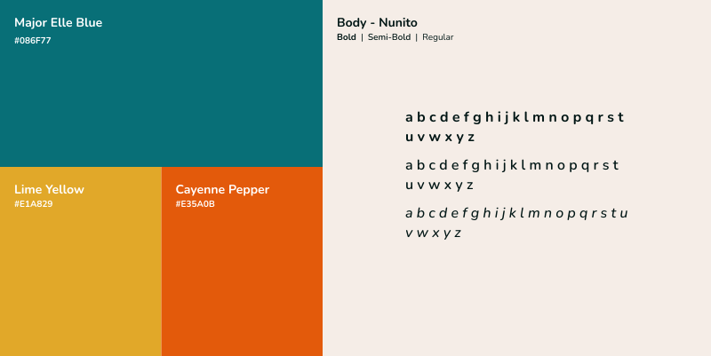
Color Palette
I went warm, autumn color palette. Autumn is the season built around curling up with a good drink, which is the same feeling as curling up with a cat over a cup of coffee.
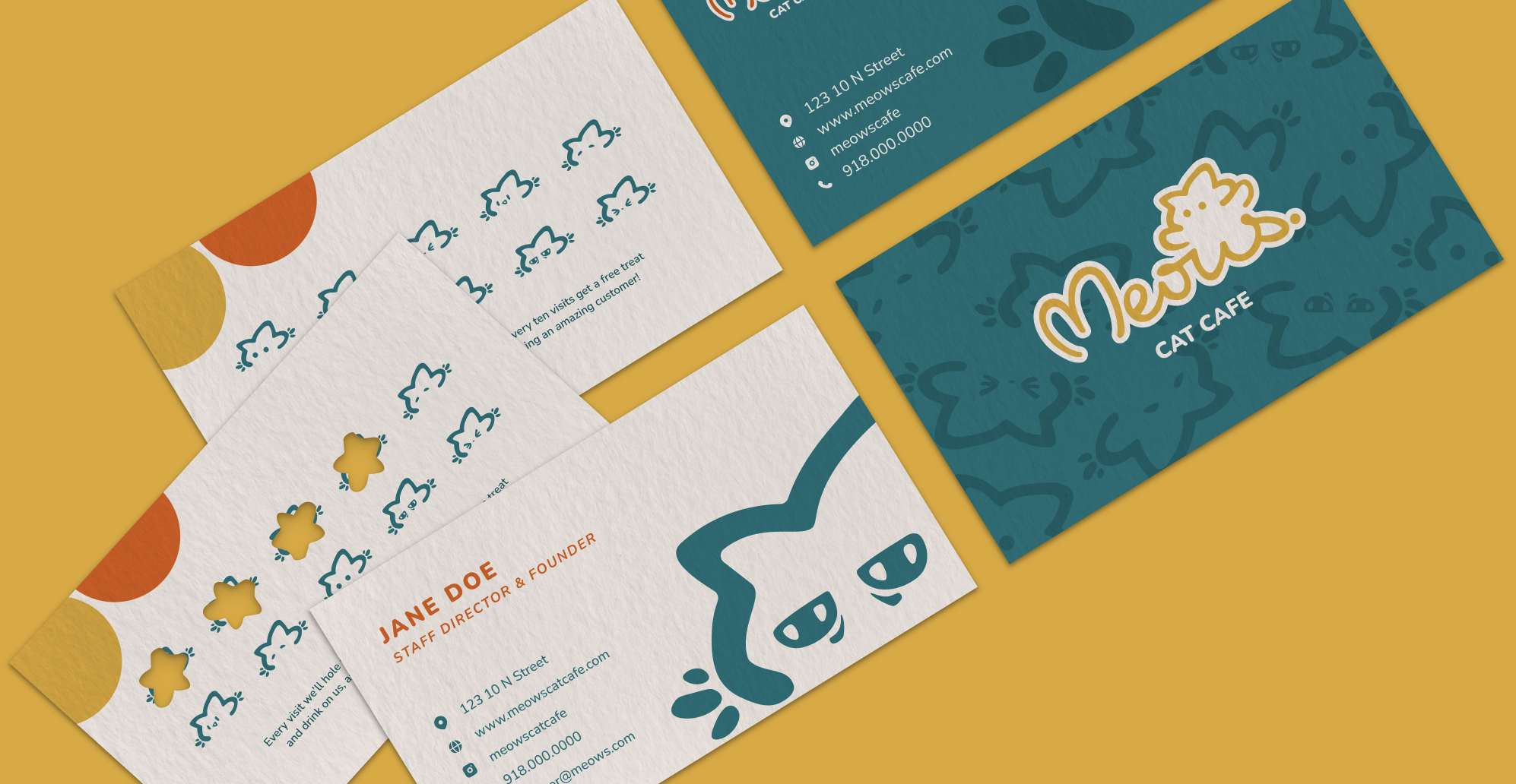
The Brand, Applied
Click any piece to view it full size.
last updated august 2026